User research and website redesign of “Sandige At Doors”
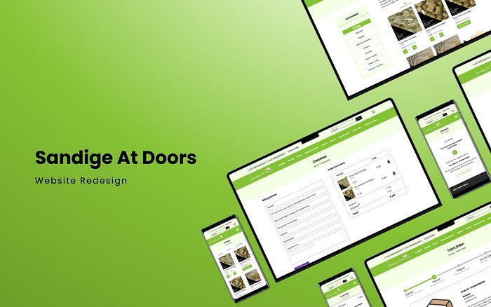
Welcome to “Sandige At Doors” user research and website redesign. “Sandige At Doors” has a legacy of 40 years in preparing authentic Bangalore and Karnataka-style homemade food products and distributing them all over India. The website sandigeatdoors.com allows users to buy them online and get them delivered home.
Background
As a UX designer, I wanted to work on a real world problem with real stakeholders. So, the sandigeatdoors.com redesign seemed like the perfect opportunity. Also, this problem was particularly challenging for me since this was my first project as a UX designer. I had to learn everything by practice.
“Sandige At Doors” has one of the best quality food products. Their website(sandigeatdoors.com) had room to improve the user experience which would in turn better their business. With such tight competition in the industry, the best experience has been long overdue.
Team and Roles
This redesign project was started by me. But soon, I met Mr. Imran Shaikh, through the (incredible)IDF community. He mentored me unconditionally through this redesign process. I later teamed up with Ms. Shivanju Varshney, a UX Designer like me, and together we worked and learned on the go.

Methodology
Any UX design or redesign should meet the goals of users and business, and at the same time, follow the best practices. For “Sandige At Doors”, design thinking methodology was used to achieve this. We conducted stakeholder and user interviews to get insights; prioritized them. One by one, we devised solutions as per the priority and designed the best possible solution.
We followed the below non-linear design process:

Stakeholder Interview
A face-to-face interview was conducted with 4 stakeholders to understand their business processes, goals, and problems. The interviews were approximately an hour-long, for each stakeholder.
These interviews yielded several insights. However, to keep the scope effective and actionable, the insights were prioritized in collaboration with the stakeholders by taking votes.
The following are the business goals that were finalized:
Increase sales, by providing discounts.
Increase user retention.
Have better communication with users.
Reduce offline orders/communication.
Guide users about how to use the products.
Click here for the complete list.
Website analysis and issues observed
After understanding the business perspective, the existing website was evaluated and all the observed issues were listed. This was done, specifically to get accustomed to the existing website. Along the process, the observed issues were also noted, many of which were identified as pain points in user interviews too.
The following are a few of the observations:
Cannot know if the product has been added to the cart; unless we check the cart
Cannot track the placed order.
Cannot cancel the placed order.
Click here for a complete list of observations.
User Interviews
We started by working with the stakeholders to fetch the Google Analytics data and order history from 2018 to 2021. Insights from this data helped us to narrow down the topics to be covered in a user interview.
Click here to view the sample questionnaire.
Used the data to select 16 users based on the below criteria:
- Users who ordered on all 3 years.
- The user who had maximum online orders.
- Users who regularly ordered offline.
- New users in 2021.
- Users who had given Google Reviews.
- Users who had ordered regularly, but stopped later.
Out of the users contacted, 9 had agreed and out of that 7 had turned up for the interview.
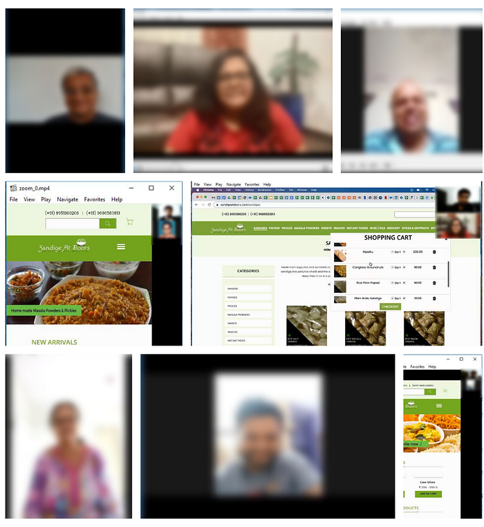
Conducted video interview and contextual inquiry with those 7 users to understand user behaviors and observe how they moved around the website sandigeatdoors.com
The user interviews yielded several findings. Major findings are as follows:
7 out of 7 (100%) users have tracked/cancelled orders offline.
5 out of 7 (71%) users wanted to check their previously ordered items.
5 out of 7 (71%) users wanted to add more than one item of a product from the product page.
4 out of 7 (57%) users rechecked if the order was placed successfully by contacting offline.
4 out of 7 (57%) users placed orders offline.
3 out of 7 (42%) users faced difficulty in remembering the products added to the cart while browsing on the product page.
Click here to view the details from the user interview.
Define and Ideate
Personas
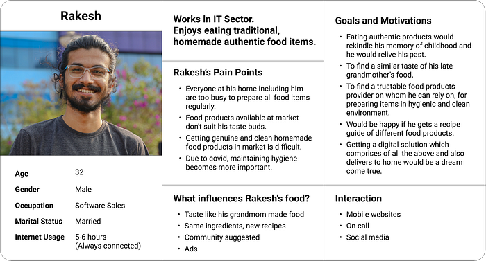
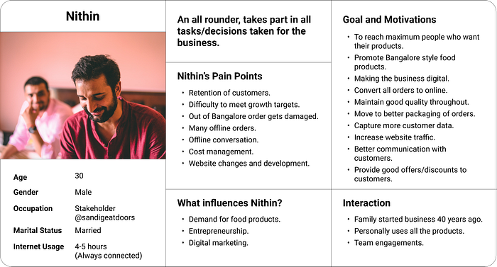
The below displayed personas- 2 user personas and 1 stakeholder persona, were created from the understanding derived from the interviews. These personas helped us to get a common understanding of who the users were and to take decisions during prioritization and ideation.

Affinity Map
Used affinity mapping to organize large amounts of data into groups or themes based on their relationships. Click here to view the outcome of affinity mapping.
From this, many insights were derived. But, due to the huge volume of insights, scope prioritization, and ideation workshop was performed with the stakeholders, as per the suggestion from our mentor.
Collaboration with Stakeholders
Hosted a workshop for the stakeholders with the created user personas and performed the below actions:
- Voted on the Point of views (POVs) and prioritized them to prepare the problem statement.
- Prepared ‘How might we?’ for the problem statement and generated ideas for those HMWs.
- Plotted ideas on the Impact vs. Effort chart to finalize the scope.
Note: Click on the above points to view details on the miro board.
The scoped ideas
The final list of ideas that would be worked upon; are as follows:
Add cancel and track order options.
Add ‘+’ and ‘-’ symbols on the product page.
Improve the order confirmation page.
Show ‘N added in cart’ under products on the product page.
Send order confirmation details by mail and message.
Display the quantity ordered (gms or kgs) details in the cart.
Sketches
Sketched solutions for the final ideas using pencil and paper.


Wireframes
Prepared wireframes on Figma for the selected sketches.
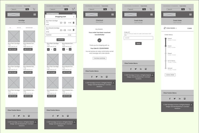
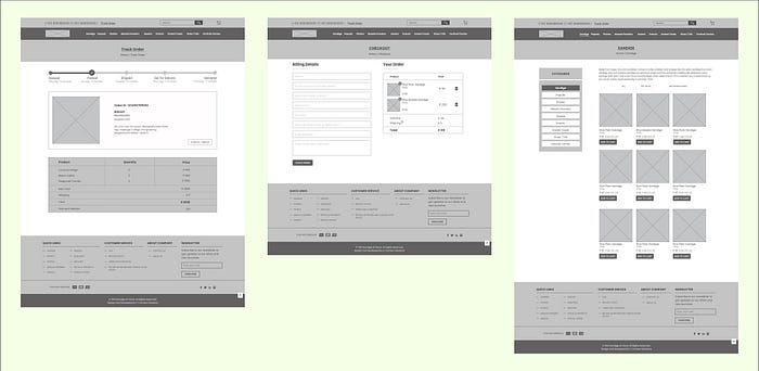
Once the first set of wireframes was completed, testing was initiated with the stakeholders and users. Based on the feedback received, multiple iterations of enhancements were done. Click to view the details of mobile iterations, and web iterations.
Wireframe Prototype
Click here for a mobile wireframe prototype.
Click here for a web wireframe prototype.
Visual Designs
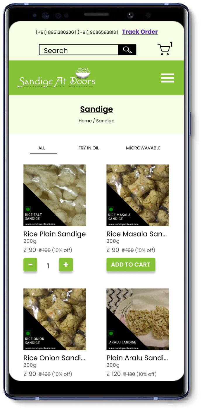
Converted the final wireframes into visual designs and prototypes on Figma with improvements.
Style Guide

Sample mobile designs


Sample web designs


UI Design Prototype
Click here for the interactive mobile prototype.
Click here for the interactive web prototype.
Demo of prototype
Usability Testing
Inspired by ‘Nielsen Norman Group’ we have written the realistic test scenarios, encourage an action, and don’t give away how the interface should be used:
- Buy the mentioned items from “Sandige At Doors”: 1 quantity of ‘Rice Plain Sandige’ and 2 quantities of ‘Rice Masala Sandige’.
- Find out the status of the order placed at “Sandige At Doors”.
- Let’s consider that your previous order was delivered. Everyone at your home loved the items and requested you to order again. Now, provide the feedback for your previous order and order again.
- You have to go for a long vacation immediately. Hence, cancel the placed order.
We have begun usability testing with above mentioned scenarios with users to observe and analyze how they interact with the designs. We will be updating the results here once we complete usability testing.
We would measure the usability using the below metrics:
- Success rate (whether users can perform the task at all).
- Time taken to complete a task.
- The error rate.
- Users’ subjective satisfaction.
Major takeaways
This is our first UX work and it was a great learning experience. Major takeaways for us are:
- The most important learning was design process is a non-linear approach, since we had to iterate multiple times to come up with the final design.
- We learned to push away the urge to jump to the solution directly and focus on the user’s perspective.
- Learned the importance of prioritizing the scope through the workshop with Stakeholders. Facilitating the workshop was a great learning experience.
- Got hands-on experience with tools and learned terminologies of design.
- Understood the importance of sketches and lo-fi wireframes. It helped us identify the issues in an early stage of Design.
Overall, we learnt more while collaborating than we could have learnt individually.
Connect with us
🤝Do feel free to reach out to us on LinkedIn — Ashwin or Shivanju for any discussion or collaboration. We will be more than happy to have a chat with you!
Thank you for reading till the end. It means a lot to us✌.️ If you liked this work make sure to hit the 👏 button and also provide feedback through comments.
