Case study: Reduce complexity and enable quicker access to relevant information.
This case study is done as a hands-on Capstone Project for the 10week-Design Thinking workshop.
Task
The goal of this assignment is to generate one disruptive idea and one MVP idea to solve the problem specified below. The ideas should be focused on growth and transformation.
Problem Statement
HMW reimagine the availability of relevant information to help employees benefit from the knowledge available within an organization?
Deliverables
Prototype or Sketches of one disruptive idea and one MVP idea.
Team
The participants of this workshop were grouped into a team of 2 each. I was also teamed up with one of my colleagues, both of us were responsible for all the activities performed.
Design Thinking process
Design thinking is a process where we are going to understand users and identify their problems and work on those problems to find out solutions.
The whole process is divided into five parts…

Empathize
Empathize stage revolves around understanding who is user and their interaction with the space.
I interviewed five users and tried to find out their pain points. Let me take you through the questions I asked during the interview. However, these are just guidelines that helped me through the conversation. Because I love to chat, not question my users.
Below is the sample questionnaire:
1. Intro and what am I trying to do.
Generic questions:
2. How is your typical day at work?
3. What are your usual work timings?
4. What is your work profile or what role do you play?
5. What is your total experience of work?
Information-related questions:
6. What all kinds of information do you usually search for related to your project work?
7. What kinds of information do you usually search for not related to your project work?
8. How often or when do you search for any information required?
9. What makes you search there?
10. Which information do you feel is easy to get?
11. Why do you feel it’s easy to get it?
12. How much do you trust the correctness of this information?
13. Which information do you feel is difficult to get?
14. Why do you feel its difficult to get it?
15. If you were given a chance to get what information you need at your fingertips, which will you choose first and why?
16. How do you manage when you can’t find some information?
17. What do you feel about the workaround?
18. If you had a magic wand how do you solve this difficulty?
19. If you get stuck anywhere whom do you contact?
20. For what information do you search out of the organization, which you feel you might get internally?
21. How do you rate the ease of getting information in our organization?
22. Do you know anywhere/any website, which you felt amazingly solves this problem?
23. Tell me about the last time you searched for some information? How was the experience?
24. Let’s pretend I want to search ……., can you please guide me on how do you go about it?
Closing:
25. What haven’t I asked today that you think would be valuable for me to know?
26. May I contact you if I have any other questions regarding them?
Define
Personas:
Based on the information collected, we found personas clearly taking shape.
Personas help us to get a common understanding of who the users are and to make design decisions. Let’s see what our personas are like, and what are their needs and pain points.
Divya Singh — Content Designer

Shravan — Analyst

How might we?
Having the persona in mind we broke down the problem statement into a few detailed HMWs.
- How might we provide an easy accessibility experience to users for the available information internally?
- How might we provide a seamless onboarding experience to new joiners that would help them to get clarity about their work, project, and team members?
- How might we simplify navigation to the information wanted by employees?
- How might we have a career view where the employee would be able to select their future path?
- How might we create a seamless, next-generation, and personalized learning experience?
- How might we create a seamless, technologically advanced, and personalized technical knowledge-sharing process and platform internally?
- How might we create easy to use, collaborative, and interactive knowledge-sharing process and platform internally?
- How might we enable quicker access to relevant information that helps a seamless, single touchpoint exercise for employees?
Modified problem statement — HMW:
After we prioritized the above HMWs we combined and formed the final problem statement shown below:
How might we reduce complexity and enable quicker access to relevant information by providing an interactive system for knowledge sharing, learning, and career growth?
Ideate

This is the stage when we have to start thinking of solutions to the user’s problems. We are not supposed to think about any solution before this stage, so now the time has come, let’s start finding solutions for the problems that we have figured out in the previous stage
To generate ideas we defined parameters as below from the final problem statement.

Shared value proposition:
To get the best ideas we understand the business and user values by creating a shared value system shown below

Road map:
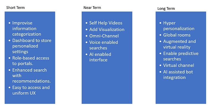
Since we need one MVP and one disruptive idea we are grouping ideas in terms as shown below:
Prioritized Disruptive idea and prototype:
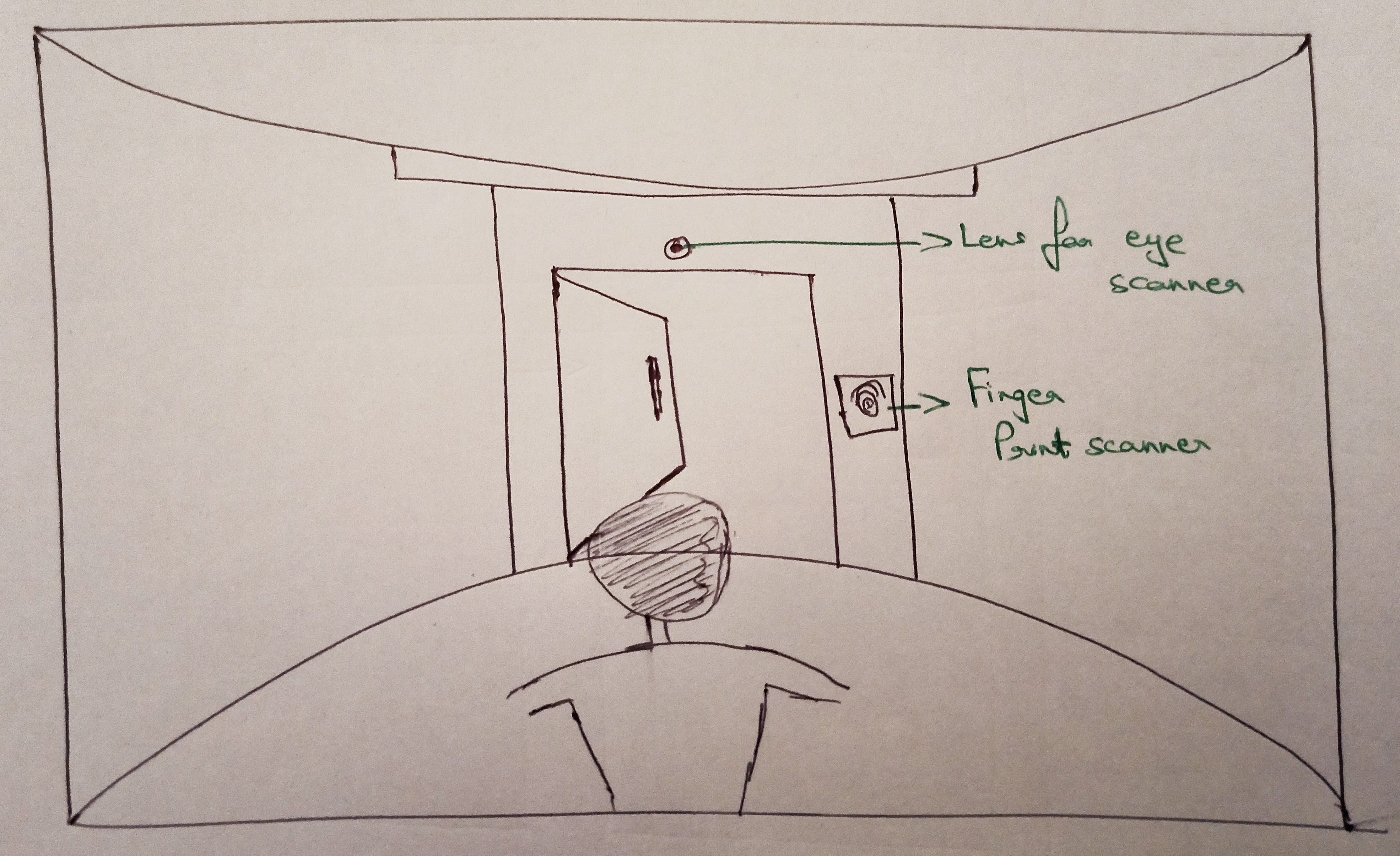
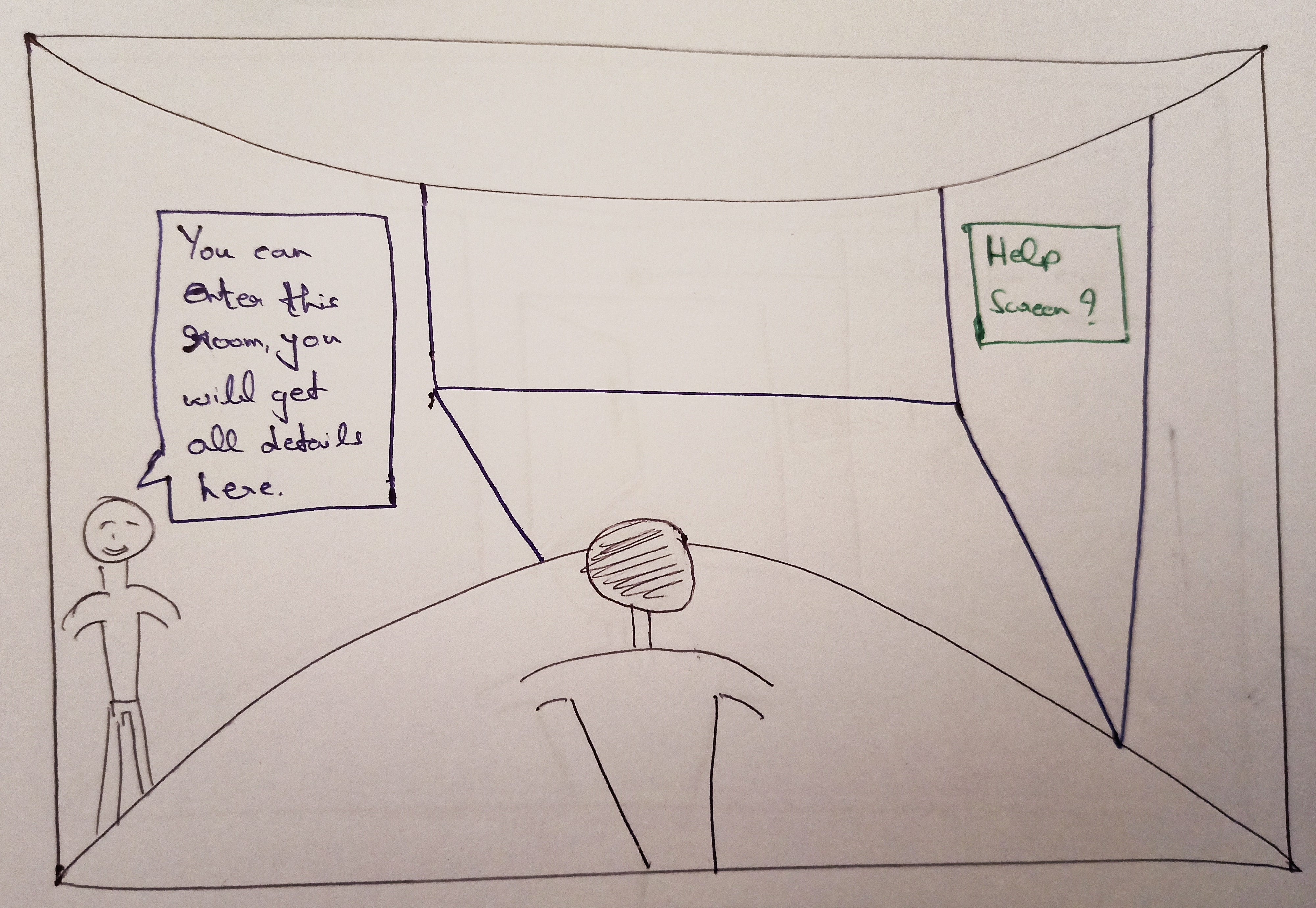
We would be building a virtual reality experience as shown below. To make things simpler we are considering a situation where an employee would want to search for a policy:
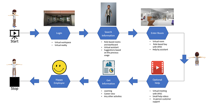
- An employee enters the virtual home by fingerprint scanner or eye scanner.
- Beckey(Virtual assistant) welcomes Amit and asks how can he help Amit. Amit responds that he wants to know about higher studies policy.
- Beckey guides Amit to a room and informs him he would get all the details inside the room.
- Inside the room, there are details about the policy, eligibility criteria, and also a help screen that will play small videos to help.
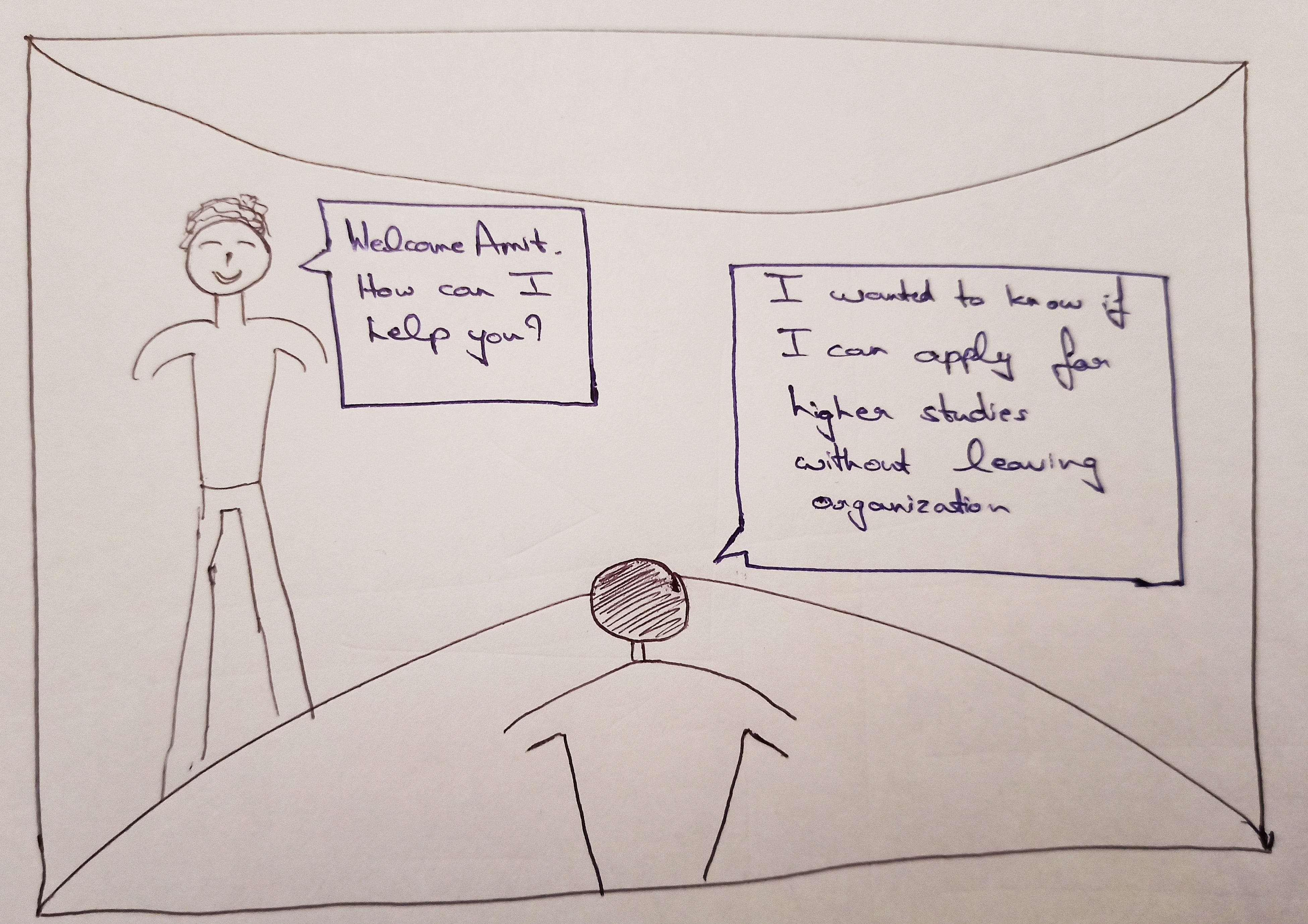

Below is the flow of an employee seeking information on virtual reality:
Prioritized MVP idea and prototype:
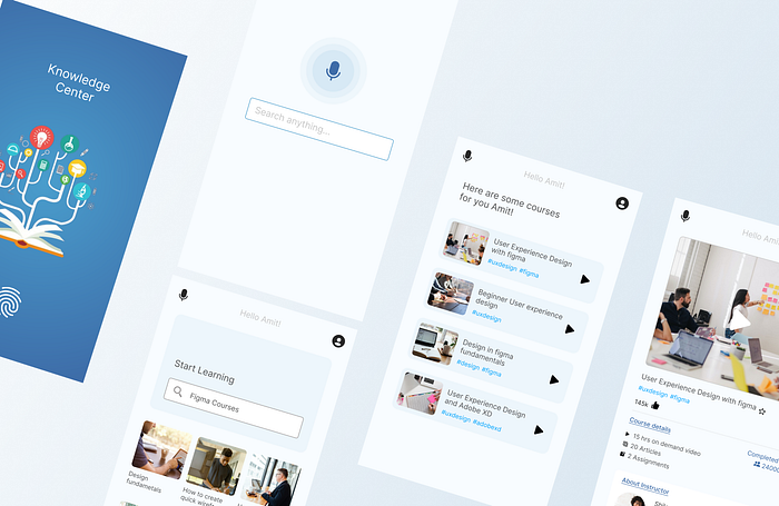
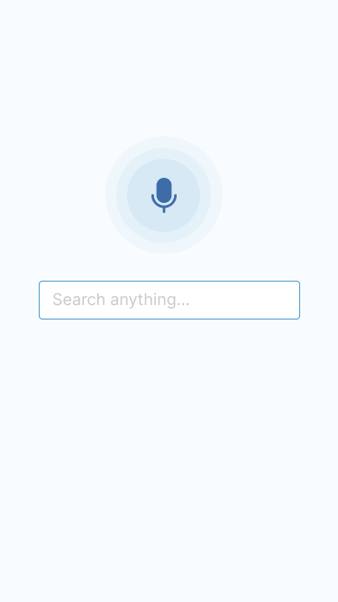
We would be building a mobile application. Let’s consider a flow where an employee is searching for a course to learn Figma.

Once we were done with the sketches we started building the visual design as shown below:



Below is the link to the prototype for the same flow mentioned above:
Test
We considered testing with the same users with whom we did the interview and also a few more employees. Below are the findings we got once we completed testing:

Learning
This project gives me an understanding that how difficult it is to bring out the idea of new technologies like virtual reality.
Conclusion
When users are in a physical real-world environment and collaborate with virtual users, they would encounter a lot of challenges. For example, what if when another real-world physical person is walking by. How would it affect the virtual users’ 3D avatar projecting to the environment? Would this 3D virtually overlay it? Or users would get a warning as an error? Those are all challenges that need to be overcome and thought about. I believe with more study, research, and careful user experience design, would address those challenges and shape the overall operations in the future. Virtual reality can enhance people’s life quality and finally benefit people’s lives.
